J. Chicken
San Gabriel, 2021
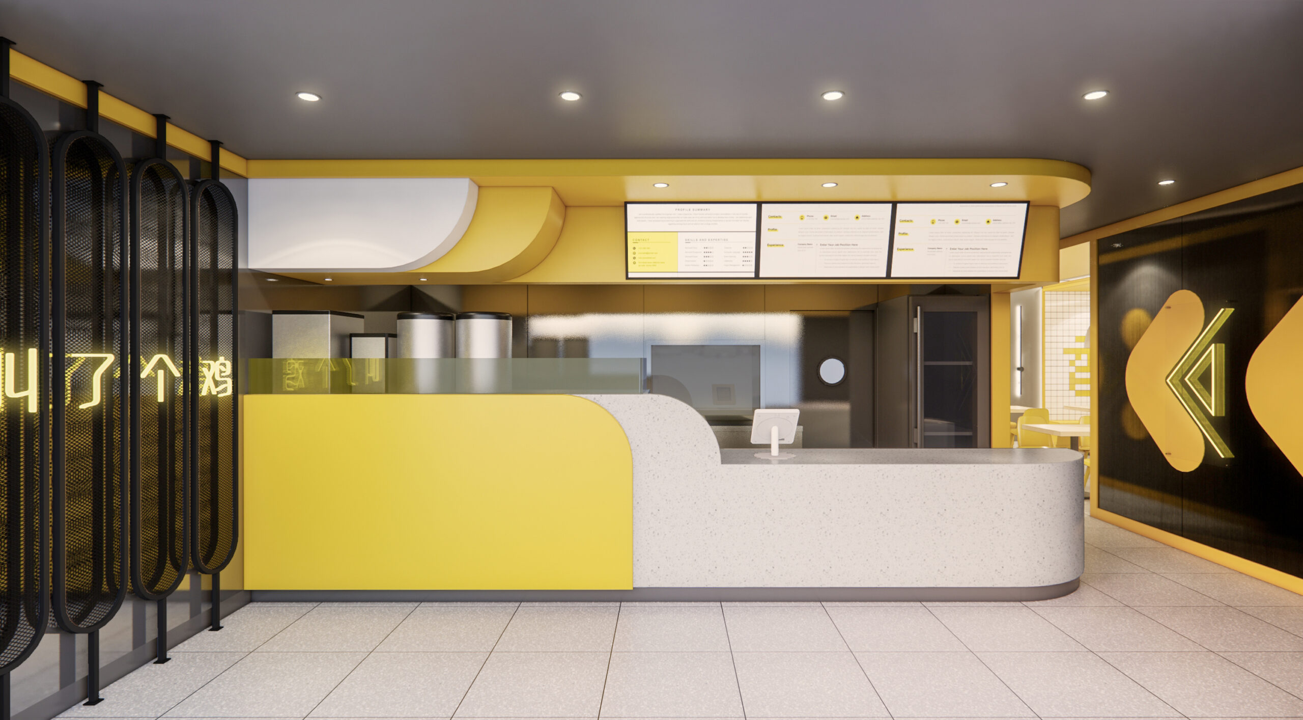
This is the first location of J. Chicken plan to open in Los Angeles. The chef team came to us and urge to rebrand their signature item, fried whole chicken. After trying out the fried chicken, a lot of thoughts started to pouring: crispy, juicy and flavorful… To capture that undefeatable taste, we decided to use very bold color yellow, black and white. The color combination itself creates a typology that is hard to leave behind. The distinguished hue of yellow definitely weaves the space together.
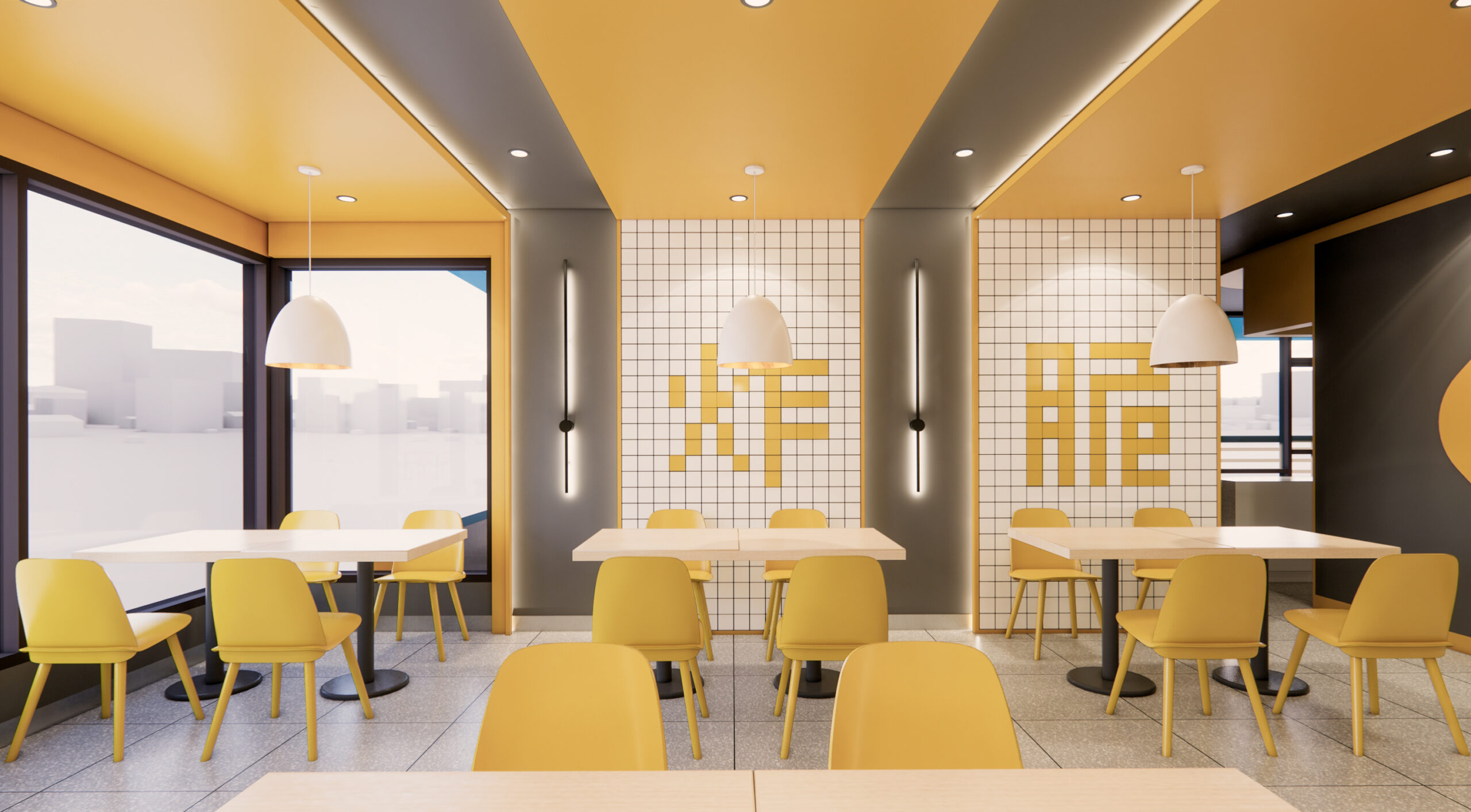
The bar counter is intentionally pushed towards the storefront, leave a potential to let people lineup at the front. The minimal geometric shape service counter extends to the side corridor and is nicely forming an arrow for circulation. Once you walked along the corridor, the neon signs on the both sides of the wall will make sure that you don’t ever get lost. Moving on to the dining area, it is a large open space, yet we would like to create more movements. The ceiling are painted in black with strips of LED washed yellow light coves. The coves are also extended to both side walls and the back of benches.
To add little more fun, on the backside of the bench, we played with the square tiles and form some fun letters in Chinese. Yes, they literally means, crispy, fryed, goodness.